
How to Build a Financial Advisor Website that Converts: The 5 Essentials
A free website platform (full breakdown & video walkthrough), what to include in a welcome video, new social content template

Welcome back,
This week, we're going to break down a topic that if done well, could make you hundreds of thousands of dollars throughout your career.
→ How to build a website that converts visitors to clients
While not an exhaustive list, these are the 5 most important pieces to have on a website if you want it to convert (from my own experience as a designer):
1) Case studies
There's no better way to describe what you do than showing how planning makes an impact in people's lives.
If you understand the true value you're providing to clients, you can write a few paragraphs that break down why someone reached out, what their situation was, and how working together solved their problems.
Keep things anonymous for privacy purposes, but use real stories to help show what financial planning looks like in action - like Tyler's website:

2) Pricing
People want to know what you do and what it costs.
Case studies can explain the service without showing a list of boring bullet points, and a dedicated pricing page can easily show someone the cost of working together:

It's understandable to want to hide pricing, but you'll have higher quality inbound leads (and likely more of them) because anyone coming across your site will have a better understanding of what the service looks like & costs ahead of time.
3) "Next Steps"
People typically don't know what working with an advisor looks like, so tell them.
If you have a uniform process, you can easily break down the introduction and onboarding process.
You'd be surprised at how comforting this can be when someone thinks that meeting with an advisor means they're going to get sold products over a phone call:

4) Sticky navigation
An underrated piece of the website, your navigation should always be in view.
For example, no matter where you're at as you're scrolling AllStreet's site, you're one click away from being able to schedule a call and the CTA button (Talk with an Advisor) is always in view:

For mobile user experience, a sticky navigation also keeps the menu within thumb's reach and helps avoid the use of "scroll to the top" icons that block portions of the page.
5) Clear CTAs
As simple as it sounds: tell people exactly what you want them to do.
Two of my favorite call-to-actions are "talk with an advisor" and "schedule a call".
It doesn't get more straightforward than that and it doesn't leave any question as to what a visitor should do next.
For example, every time someone gets to the bottom of the page of Rachael's website, they're prompted with a direct, friendly CTA:

Recap - 5 pieces of a converting website:
1) Case studies
2) Pricing page
3) "Next steps"
4) Sticky navigation
5) Clear call-to-actions
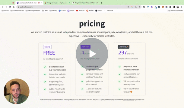
A free website platform
I spend way too much time doing research and playing around online.
Sometimes it feels like a waste, sometimes I stumble across little nuggets of gold.
Here's my most recent find:
- Realnice - "the fastest, most delightful website builder ever made — and the only one that lets you connect a custom domain on the free plan"
I'm all for thriftiness and being someone who can't stop buying domains, it's been frustrating that every website tool I've used requires a paid plan to connect a custom domain.
It looks like Realnice just launched in 2023, so it's relatively new and I wanted to share my initial experience of creating a simple version of my current personal brand website:
If the platform allows for it, I'll be making templates to share and when doing so, I'll record behind-the-scenes tutorials of building them, similar to the video walkthrough from last edition.
What to include in a website welcome video
If you can confidently convey your value, video content can be the strongest part of your marketing mix.
Outside of YouTube videos and posting to social media, your website is the most valuable place to implement this.
I recommend it to every advisor I build a website for and most of those who have done it have seen extremely positive results.
For example, Riki at 2.0 Financial wanted to implement this strategy from day one and we launched his firm's website with a 2-minute explainer on the about page:

Club member Tommy Modec recently launched his firm & new YouTube channel and made a great intro video (watch here):

Root Financial has gotten a lot of buzz on social media recently and they have one of the best intro videos for an advisor that I've seen (this is professionally produced, don't worry if your first homemade one doesn't look the same):

While not on my website, this intro has been at the top of my Twitter profile for the past year and a few people have referenced it in discovery calls:

So, how can you make your own?
First, read this guide for how to record videos - and then use a few of the following bullet points for ideas on what to include within your intro:
- Think of it like a conversation, how would you talk to someone you just met in public? Introduce yourself, your name, your role, the business, etc
- Explain what you do - not a list of services, but how you actually help your clients, what outcomes they receive as a result of working with you
- Explain who you serve / why you started the business. Answer the question, what makes you the right advisor for them?
- So that the video isn't a straight shot of you for several minutes, add overlays/b-roll like Tommy, Root, and I did above