
How to Design Your Social Media Profiles to Convert - YFCD #7
How to make a custom one-page website, top creative tools [graphic], 5 social media tips, and member examples
Welcome back,
It's been a warm end-of-summer here in Kansas City:
After a quick trip to New York last week, I've spent the past several days busy with creative work & wrapping up production for AllStreet Academy.
During this time, I haven't been too active on social media. However, inbound inquiries & new business haven't stopped coming in. While there are a lot of different marketing strategies & things in motion to help with this, I credit a portion of the traffic that converts to having a "proper" social media profile.
For example, I got a DM last week about my pinned tweet, which introduces myself, my work, and shares links to learn more. A pinned post is only one piece of the puzzle, so I wanted to share a few tips for building a social media profile that converts:
1) Clear bio
Your bio should explain two things—who you are & what you do:
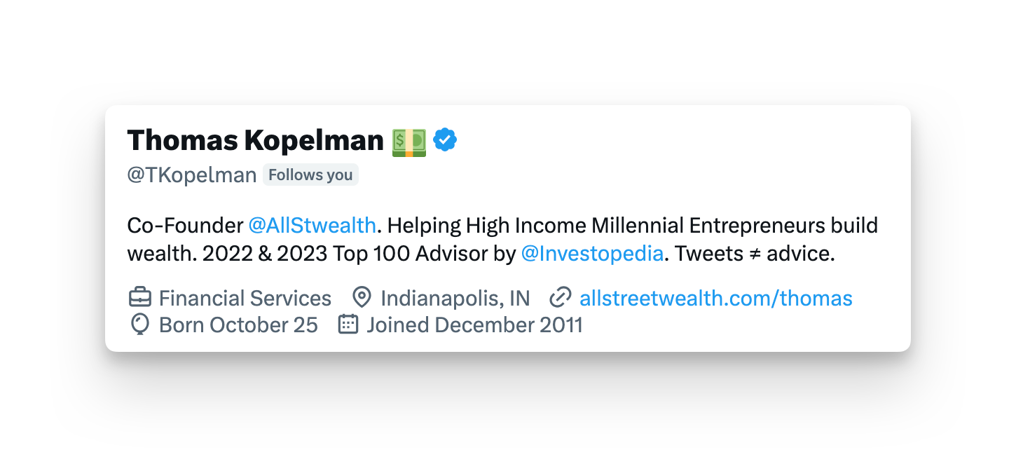
In two lines, Thomas explains what he does & who he helps, while giving a little bit of social proof.
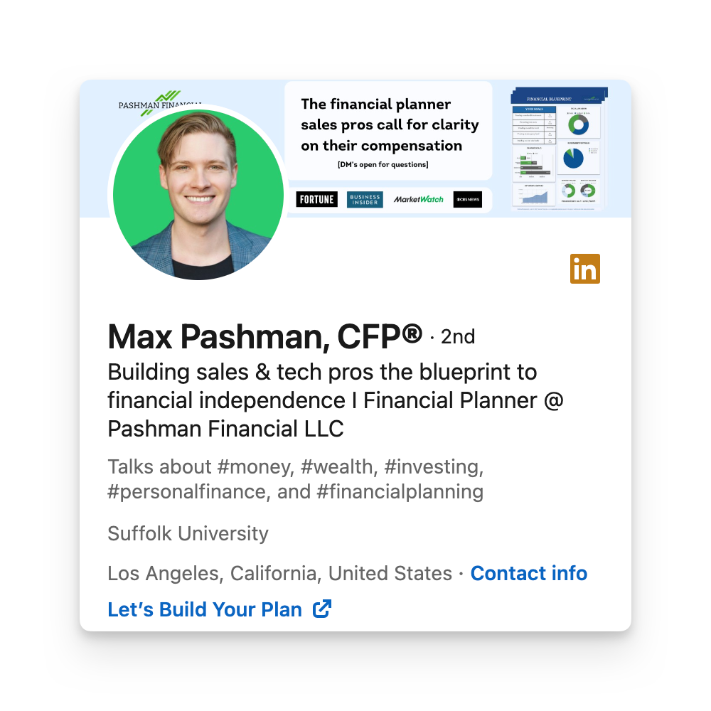
Within his LinkedIn headline, Max captures who he serves & what he does:
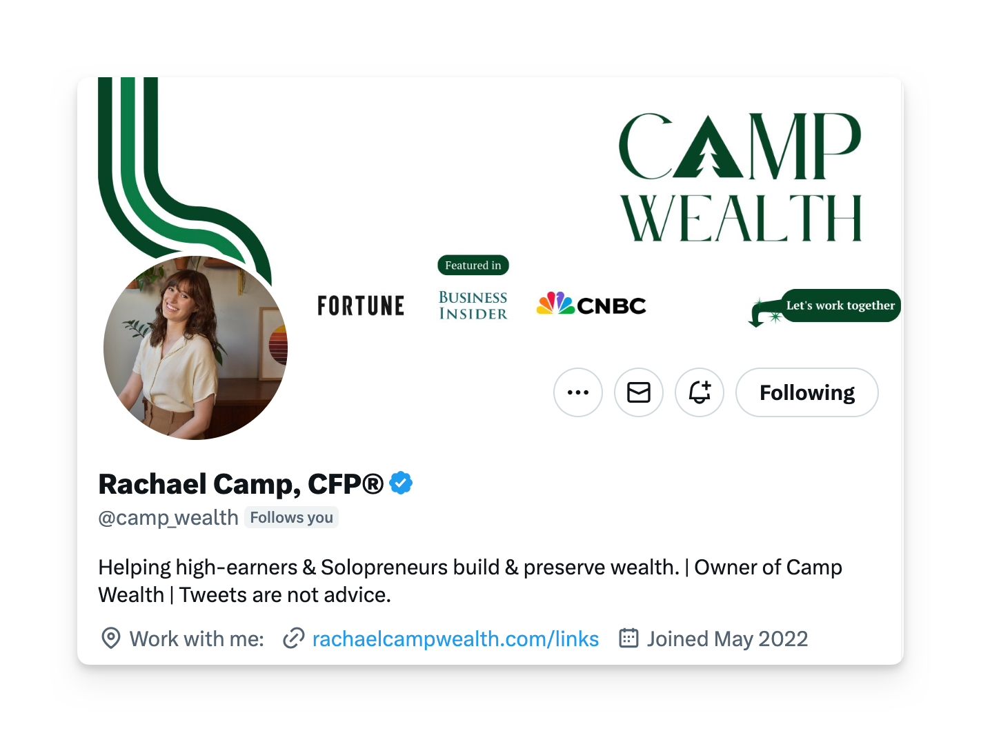
Rachael's profile hits on all 5 areas here, but her bio & singular link are a perfect example:
2) Profile pic
Your profile picture should be clear and on-brand. It could be as simple as a headshot, or you may take the extra step and get some lifestyle pictures taken.
Either way, don't be the person with a pixelated, suited-up picture or the person with a blank, default avatar.
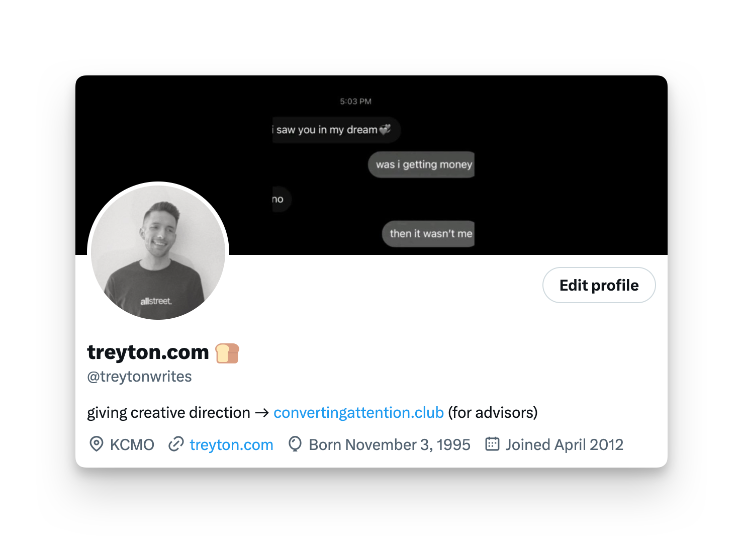
My whole brand is black & white, so my profile picture reflects that:
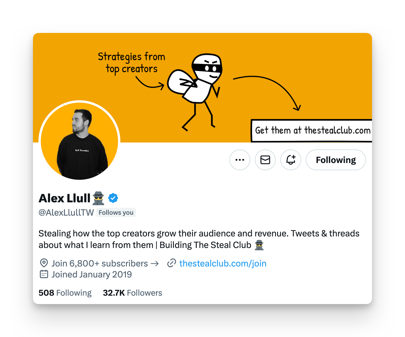
Some people use a solid color as their background to try to stand out & build brand:
Whatever route you decide to go, don't change your profile picture often.
People connect more with a picture than a name so when it's changed, you may lose familiarity in the feed for a while.
3) Banner
I think an attention-grabbing banner should be simple and not include too much information. You also have to be mindful of different device sizes and understand that something visible on desktop may be illegible on a mobile screen.
I like the structure of using a main tagline, media logos (if applicable), brand colors, and a high-quality image or cutout.